STIL Vodka
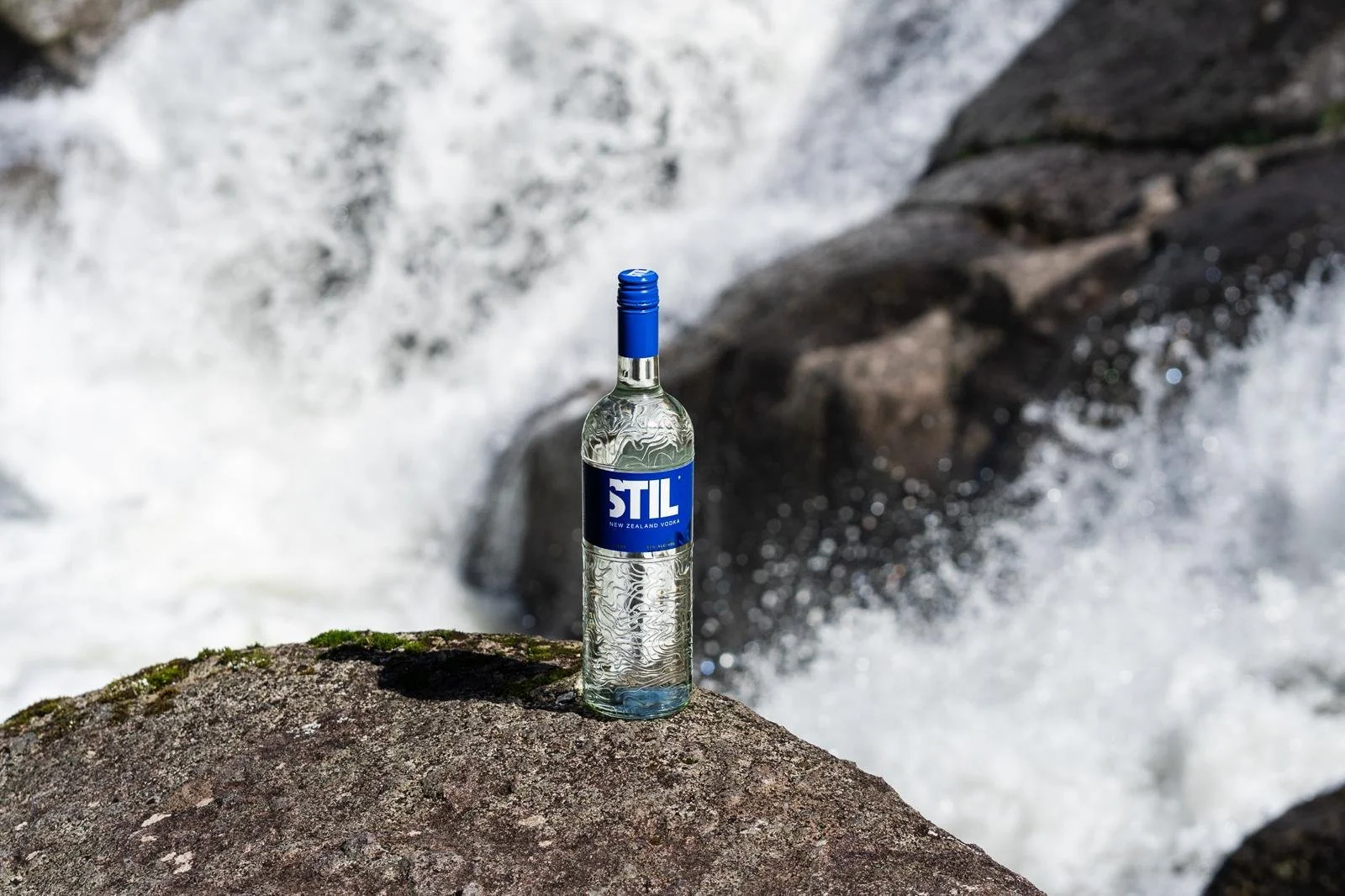
This project was about bringing STIL Vodka’s sense of place to the forefront - using the landscape it’s made from to shape the bottle itself. Inspired by the topographic lines of the Kaimai Ranges, the design connects the product back to its origin, while the refreshed label keeps the design clean, modern, and considered.
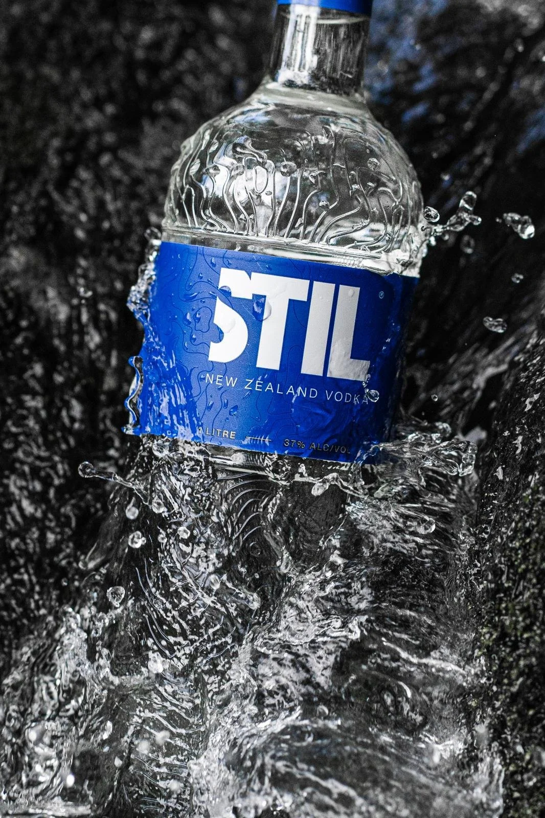
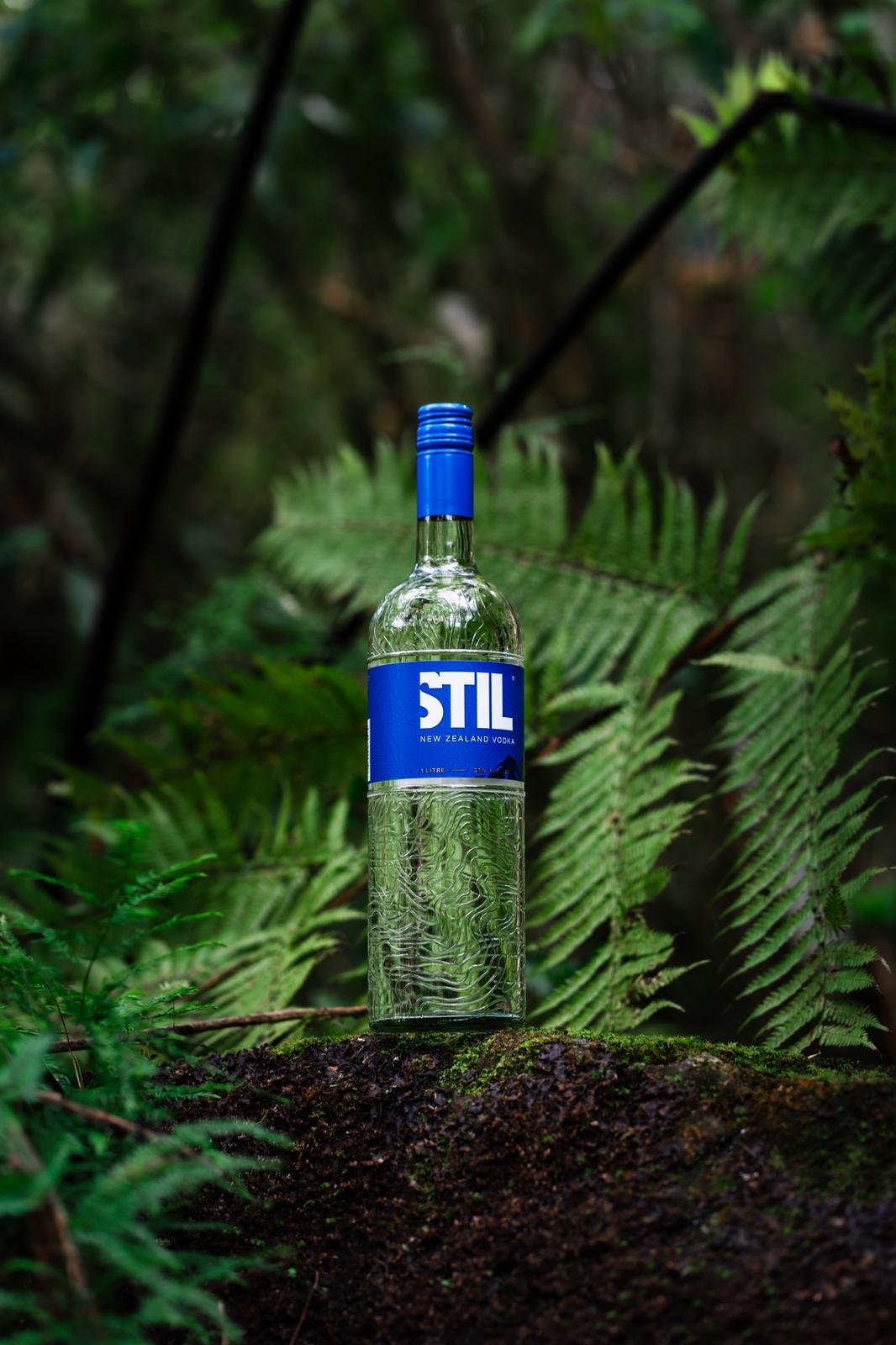
The design takes its cue from the Kaimai Ranges, hand tracing the landscape’s topographic lines and bringing them onto the bottle and label. By embedding this sense of place, the packaging feels connected to STIL Vodka’s origins. At the same time, we wanted to honour the brand’s heritage as a well-loved Kiwi icon, making sure the refreshed look feels modern and considered without losing that familiar, trusted STIL character. Every detail- from the embossed lines to the layout and colour choices tells a story of place, craft, and legacy, resulting in a design that’s contemporary, vibrant, and unmistakably STIL.